

Friday, November 26, 2010
Friday, October 29, 2010

Sunday, August 29, 2010
FUN FALL BOOKS illustrated by ME:

There's two great kids books coming out this fall and I was happy to be a part of both! The two books are very different, but both books offered a great experience for this illustrator. Gibbs Smith's BART'S KING-SIZED BOOK OF FUN by the amazing Bart King is filled with fun & crazy things to do and I got to add some wild & wacky illustrations! Teacher Created Material's WHEELS ON THE BUS is an illustrated retelling of the classic song we all grew up with and I enjoyed producing some simple & sweet illustrations for that book! Below are some illustration from BART'S KING-SIZED BOOK OF FUN:

And here are some illustrations from WHEELS ON THE BUS:

You can find both these books at your favorite bookstore
or check them out at Amazon.com using the links below:
Thursday, August 12, 2010
Pocket Doodles for Boys DRAWS some attention!

Thanks to the Canton Citizen for featuring me & my book
Pocket Doodles for Boys in their newspaper!
Pocket Doodles for Boys in their newspaper!
You can check it out here...
Monday, May 31, 2010
Super Hero House Pets (Part 2): THE COVER!

My last post detailed the designing of the above characters for a color cover for Fun For Kidz magazine as well as a black & white 4 page comic. Below is my process for creating the cover.
Here's my first sketch. In addition to the characters, the cover had to also include the magazine title, the side blurbs of what's inside and the brother & sister characters who are on every Fun For Kidz cover (I designed them too):

Next I did a rough for the editor & art director on a "mock cover sheet" supplied by the magazine. I wanted the super pet characters to tower over the city as the sister & brother looked on:

I wasn't crazy about the placement of the pets and they were supposed to be Super Hero HOUSE Pets not Super Hero CITY Pets, so I thought I should show houses in a neighborhood instead of a cityscape (D'uh!). So I did a second rough:

The editor & art director approved my second sketch, so I went ahead to penciling. I usually use #2 pencils I buy at CVS and draw it on super smooth Strathmore Bristol Plate 500 series. I don't use a lightbox that often, I like to start my pencils from scratch while referring to my rough to see if I can improve the composition, but I really liked the way the rough was set up, so I used a lightbox to capture the image. Here's the penciled cover:

I inked the image right over my pencil lines with Pigma Micron pens and Rapidographs (this is my favorite part):

I scanned the ink image into Photoshop and colorized it. I filled the large areas and used the paint tool for highlight colors. I used layers a couple of times too, like when I made the lightening bolts coming off the cat:

Here's how the cover will look on the newsstands when it comes out in September. I added a dummy titile & side blurbs as well as a speech balloon for the boy to help explain what the heck is going on:

The 4 page comic isn't due until mid to late summer, so I'll post that as well when it's done!
Tuesday, May 25, 2010
SUPER HERO HOUSE PETS!
I was asked by Fun For Kidz magazine to create a b&w 4 page comic and a color cover based on my comic for their upcoming issue featuring house pets. I asked the editor if I could make them super hero house pets and she said "Fine. Whatever" ...so that was cool!
I had a comic idea in mind and I was going to use a cat, goldfish, dog & hamster for the main characters, so I had to figure out their look & powers. I tightened up my roughs and drew each character separately for this post which I usually don't do under a deadline.
I drew most of these roughs for the cat character in my car with a stolen tiny little mini-golf pencil while waiting for my son to get out of school...

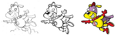
I decided to go with an electric cat. Here's my penciled, inked & colored versions of the finished character. Like all the characters below, I inked her with a Pigma Micron pen on Stratemore Plate Bristol then scanned her into Photoshop & colored her:

Here's some of my rough sketches for the fish character. I usually do many thumbnails before I do pencil sketches like these. I was going to keep him in his bowl, but it reminded me too much of the goldfish from Cat in the Hat...

I decided to go with a super flying fish:

I knew I wanted the dog to be super strong and the leader of The Super Hero House Pets. Here's some dog roughs...

Here's the character I went with, but I'm second guessing my choice, he seems a little boring to me:

And here are the roughs I did for the hamster. I wanted the hamster to be able to grow into a giant hamster. I was inspired by Marvel's Giant-Man/Goliath...

Here's the penciled, inked & finished giant hamster. I think he's my favorite:

The color cover is due long before the interior comic, so I'll post the finished cover as soon as it's done.
Here's the Super Hero House Pets:

Monday, May 17, 2010

Thursday, April 22, 2010
Bart's KING-SIZED Book of FUN!
A recent project I really enjoyed was creating the illustrations for the kid's book Bart's KING-SIZED Book of FUN by Bart King (you can check out Bart's blog here). Although the book won't be released until September, here's a preview of the illustrations!


Sunday, February 28, 2010
IT HAS ARRIVED!!!

My new book POCKETDOODLES FOR BOYS is hitting bookstores this week. If you see it on the shelves, check it out and let me know what you think. THANKS!
Friday, February 26, 2010
5 Days of Favorites: FANTASY FRIDAY!
I took a bunch of my favorite fantasy characters and threw them all together in this fun little mess below!

Thursday, February 25, 2010
5 Days of Favorites: TYPEFACE THURSDAY!
I was asked to create artwork for a wonderful Christmas project at a local mall. The Rankin/Bass inspired display featured life sized 3D people & elves, a mini town and the interrior of Santa's castle! It was a great experience and I enjoyed creating the logo for the exhibit. Below are some of my design ideas & the finished logo!

The Christmas exhibit was the brainchild of artist & visionary Dean Calusdian (who usually designs haunted houses!) and you can check out his amazing artwork at www.dreamswithindreams.com !
Wednesday, February 24, 2010
5 Days of Favorites: WEIRD WEDNESDAY!
I'm really enjoying my current assignment illustrating an activity book for kids. Some of the things they're asking me to draw are just SO cool! Below is the "Roadkill Queen"! The black & white version is for the book and I quickly did a color version for this post.


Tuesday, February 23, 2010
5 Days of Favorites: TEENAGERS TUESDAY!
One of my favorite projects is illustrating STEPPING STONES! Stepping Stones is a continuing series about the lives, friendships & triumphs of four teenagers. It was originally a comic feature in My Friend magazine and now it's a series of paperback books.


Stepping Stones: The Comic Collection is in stores now and The Stepping Stones Journals hits bookstores this April!

The writer of Stepping Stones is the amazing Diana Jenkins and you can check out her blog at djsthoughts-dj.blogspot.com !
Monday, February 22, 2010
5 Days of Favorites: MYSTERY MONDAY!

I really enjoyed creating this mystery scene for a kid's magazine.
Drawn with a rapidograph on smooth bristol, colored in Photoshop.
Saturday, February 20, 2010
CHANGING STYLES:
A client who I've illustrated many children's books for ask me to come up with a different style for a series of adult employment guides. So, below are the cover designs I created for their books on CHANGING CAREERS, the PERFECT RESUME and CAREER ADVANCEMENT.

The next book was on JOB SEARCHING and below are the two final sketches they liked.

And below is the final cover design for the CAREER SEACHING guide created completely in Photoshop. Very different look for me, but I enjoyed the challenge!

Thursday, February 18, 2010
'Til Death Do Us Part ART:


Above is a little piece that had a surprisingly long honeymoon. It was first created to illustrate an article titled "I DO" in a now defunct black & white magazine, then I colored it and sold it to a greeting card company as a "Happy Wedding" card, this past fall I featured it on one of my promotional postcards and now it's on my blog. View now or forever hold your peace!
Tuesday, February 9, 2010
ANATOMY of an IDEA:
Here's a peek at a recent job I really enjoyed. I was honored that Gibbs Smith Publishers asked me to produce their latest holiday card! It was a dream job: they offered me a blank canvas with no restrictions and they even paid me for it!! I knew the card had to appeal to the masses and make people think of both the holiday season & Gibbs Smith books. Below are some of the roughs I sent them (remember these are just roughs):


The above rough is my ARTSY/FUN APPROACH. I had just created Pocketdoodles for Boys for this publisher, so I thought this card would reproduce some of the fun of the book. And I think it says that the holidays can make anyone, even business people, jolly!

The above rough is my INSANE APPROACH. I just love this cartoon and I thought it would convey the chaos of the holidays in a fun way!

The above color rough is my LOW TECH/HIGH TECH APPROACH. Snow lady reading a traditional book and robot reading a Kindle type of device. Good books can bring everyone together during the holidays!

The above color rough is my WARM & FUZZY APPROACH . Books will light up your holidays and warm your insides!

I have no idea what to call the approach I used in the color rough above. I was trying to show the joy & ideas books bring...especially at the holidays! That's the Gibbs Smith logo on the cover.

Above is my FAMILY FUN APPROACH. My favorite subject to draw is crazy characters. I think this said family, books & holidays...I think this would have looked cool in color!

Above is my EVERYTHING BUT THE KITCHEN SINK APPROACH. I threw everything into this one: crazy characters, parodies of five Gibbs Smith book series, a bus and a horse! This was my favorite, I had a great time creating it.
I sent all these ideas to Gibbs Smith because they had the final choice of design. And the winner was...

They picked my favorite which was very brave of them because it is a bit bizarre. Although they were going to produce these in full color, we agreed to just go black & white with the border and their logo in red so it would really stand out.
I'd love to hear what people thought of the roughs and the final design choice. Thanks!
If you enjoy the creative process, check out amazing artist Renee Kurilla's current blog post taking you through the character design process for her latest book series at kurillastration.blogspot.com!
Subscribe to:
Posts (Atom)

